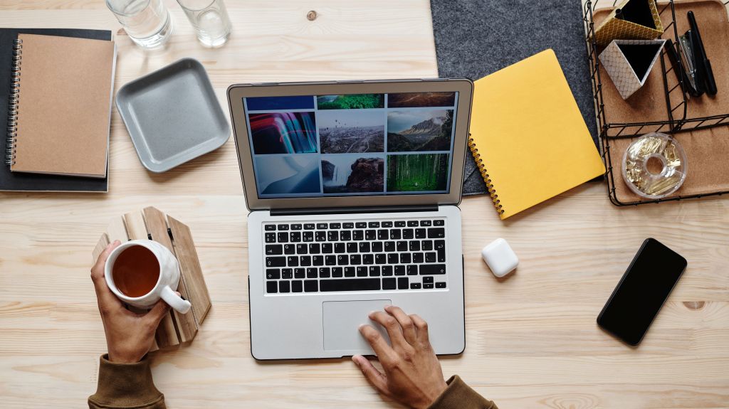
In public relations, we often say we’re in the business of attention. A great pitch or a well-written news release can still get ignored if the design looks like an afterthought. Over the years I’ve learned that two programs do most of the heavy lifting when I want a message to look as credible as it sounds: Adobe InDesign and Adobe Photoshop.
Two programs, two jobs
Adobe InDesign is a layout program. It’s where I build anything with multiple pages or a lot of text: media kits, annual reports, newsletters, brochures and event programs. InDesign lets me control typography, grids, columns and margins with precision so a 20-page report looks like one cohesive piece instead of 20 separate ideas.
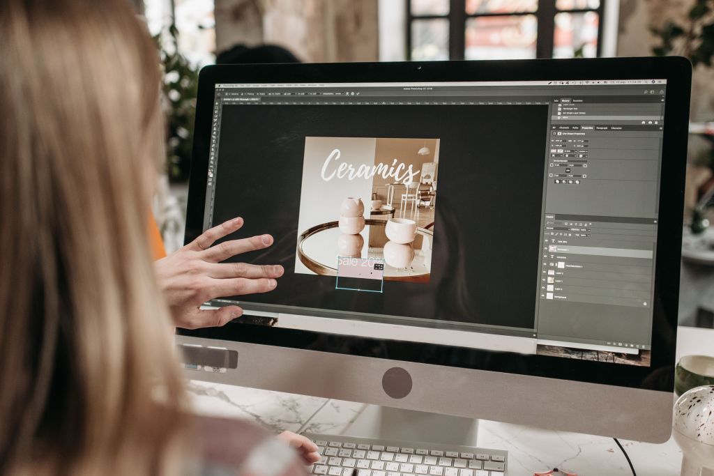
Adobe Photoshop is an image editing program. It’s my go-to for polishing headshots, retouching event photos, building social media graphics and compositing images for campaign visuals. If InDesign is the architect arranging the building, Photoshop is the finish carpenter perfecting each detail.
What makes each one special
Here’s what I love about InDesign: master pages and styles. I set up my brand’s fonts, colors and page elements once, and they carry through the whole document. When a client changes a headline color at the last minute (it always happens), I fix it in seconds instead of hours. Add in linked images and packaging tools, and it’s built for professionals who work under deadline.
Photoshop’s secret weapon for PR is layers and non-destructive editing. I can crop a photo for Instagram, resize it for a news release and adjust its color for print without ever damaging the original. Its generative AI tools also make quick fixes, like removing a distracting object from a CEO’s headshot, faster than ever. Still, I always disclose or double-check edits so we never mislead audiences. Ethics matter as much as aesthetics in our field.
how to learn these programs
You don’t need a design degree to get started. Here’s where I’d point any colleague:
- Adobe’s free InDesign tutorials walk you through everything from your first document to advanced layout.
- Adobe’s Photoshop tutorials are just as thorough and organized by skill level.
- LinkedIn Learning offers course-length training you can finish at your own pace, and many universities provide free access.
- Ask about student and nonprofit pricing for Creative Cloud, since the cost drops significantly for eligible users.
My best advice is to pick a real project, such as a flyer for a campus event, and learn by building it!
powerful tools don’t make good design
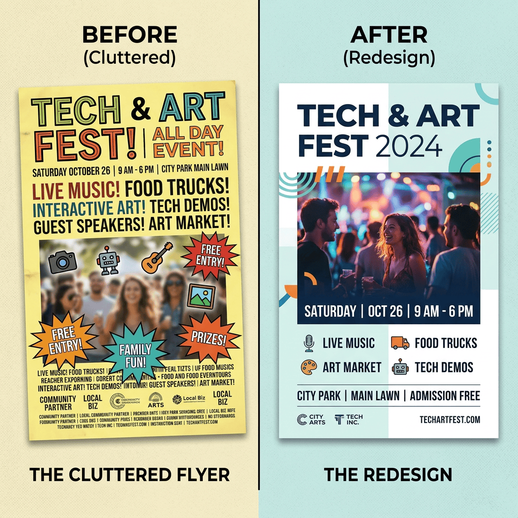
Here’s the truth I wish someone had told me sooner: software doesn’t make a design good. A designer’s decisions do. When I evaluate my own work, I ask myself four questions:
- Does it have a clear focal point? Viewers should know where to look first.
- Is there enough white space? Crowded layouts feel stressful. Room to breathe signals confidence.
- Is it consistent? Repeating fonts, colors and spacing builds brand recognition.
- Is it readable? Contrast and type size matter more than any fancy effect.
Above all, a good design serves the message and the audience. If a beautiful piece confuses the reader, it has failed, no matter how impressive the software behind it.
your turn
Open a blank InDesign document this week and build something small. Then tell me in the comments which program you’re tackling first!


Leave a Reply